Skip to content
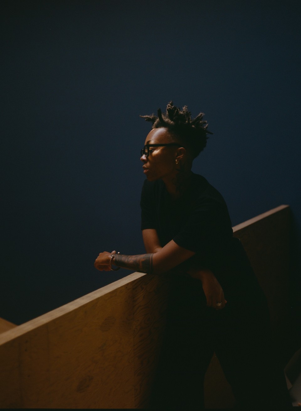
A portrait of Kya Lou, a Black person, who looks down over a bannister which they are leaning on (wearing a black short-sleeved shirt). They also wear black framed glasses and behind them is a deep blue-colored wall.

Issue 004 Summer 2022 Interviews

Different Shades of Metadata: an interview with Kya Lou


By Darol Olu Kae

Kya Lou. Photo by Steven Traylor.


On an oddly gloomy afternoon in the heart of downtown Los Angeles’ Arts District, Kya Lou and I sit down outside of a cafe on a busy street. It’s not the most ideal location for a recorded interview, but we’re both committed to making it work. I haven’t seen Kya in person in what feels like a couple of years. Before officially starting our interview, she quips that we’ve known each other “for almost eight years!” While Kya is now an accomplished colorist, known for her evocative treatments—including the Oscar-nominated short A Love Song for Latasha (2019) and recent campaigns for Calvin Klein and Adidas—we first met when she was an undergraduate student at UCLA. Feels like ages ago now.


I can’t quite recall the specific circumstances that brought us together. It could have been a mutual friend or an event at the Underground Museum. What I do remember, however, is that we quickly formed a strong bond around photography, family archives, and the expressive power of Black music. That’s where this conversation truly began.

Since she graduated from UCLA, Kya’s path has been a winding one. Her accumulated experiences as a photographer, archivist, and film editor have greatly shaped the ways she thinks about color, seeking to unlock its largely untapped potential in moving images.

Kya’s practice as a colorist is deeply informed by her own personal history, as well as the generative qualities of sound. Citing John Coltrane’s annotation of the circle of fifths and Isaac Newton’s color wheel as a couple of key references, Kya is a singular force who is charting her own path, unsettling conventional sound-image relations and exploring new ways of thinking about color at every turn. May this conversation serve as a window into her process as a colorist and illuminate the philosophies and ideas that enliven her work.


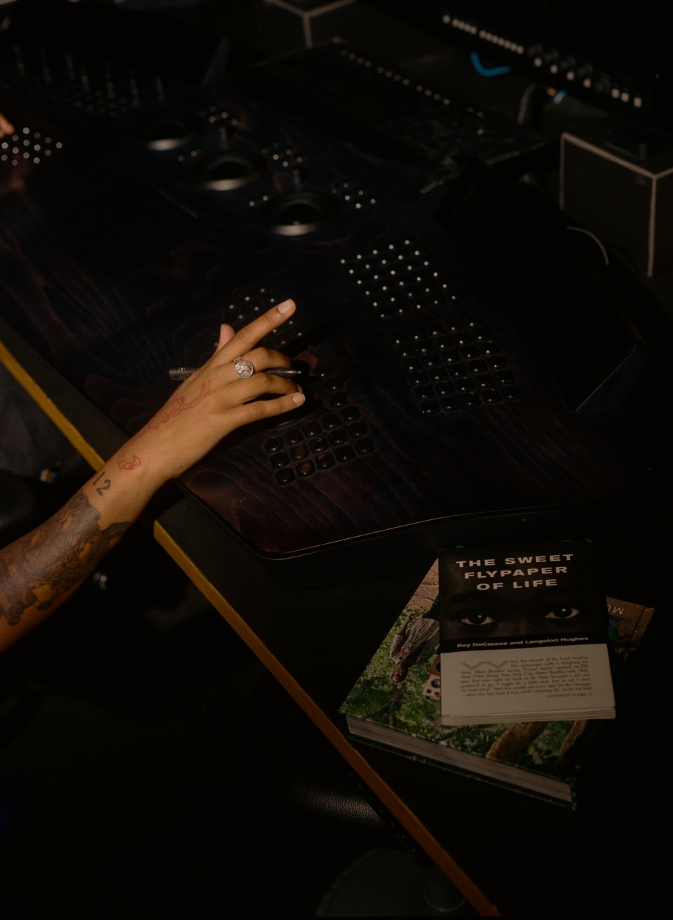
Kya Lou in her studio. Photo by Steven Traylor.

DOL: What are you interested in when you engage with color?

KL: Trying to exhaust every possibility. The image could be really dark and it could feel deep. And it could also feel saturated, and it could feel really pushed, or it can feel a little bit softer. There’s so many directions, and I’d basically like to have more time to explore as many possibilities as we can. Because, at the end of the day, I don’t really believe in trying to force a project to be something that it can’t be or doesn’t want to be. But the commercial space doesn’t really allow for that. It’s a factory system. It feels very industrial at times. Sometimes I feel like I’m selling a car. In this space, collaboration is tricky. I don’t just care about what the thing looks like or who shot the project. I’m more interested in projects that allow me to inject myself into the work. I’m the director of color—maybe not the director of the entire project, but I demand trust too.

DOL: Before working at Primary, you started your own color grading studio, Coloured Only. What went into that process? 

KL: I started that in 2017 when I realized that I wanted to be a colorist and I couldn’t get a job anywhere else. I just started coloring the homies’ projects, and that’s the name that they’re going to put for the credits. They are going to put colored by Coloured Only. I started it as a joke. I felt like all these other color grading companies, they look like “whites only,” so I said, “Fuck it.” They’re not going to let me in, so I set up shop. “We here on the corner.” I might not have all the same amenities and shit, but I think there was something about being exclusive that I felt was necessary. I didn’t want to really go in the “whites only” room. To be honest, that felt dangerous.


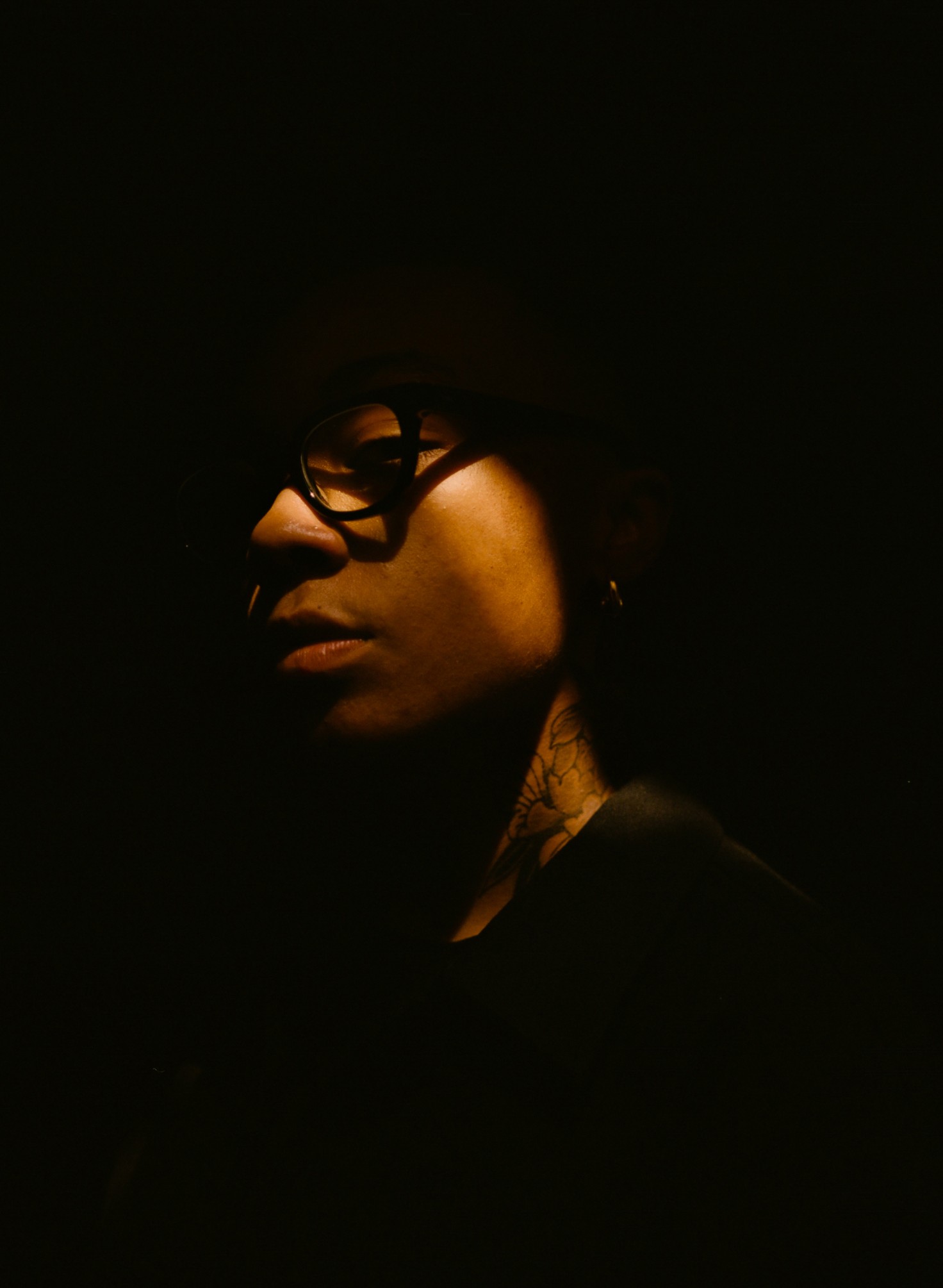
Kya Lou. Photo by Steven Traylor.

DOL: I’m not aware of any other Black women colorists working in the industry. I may be wrong, but you inhabit this really interesting space. Can you talk about how you maneuver?

KL: I’ve learned to be expansive with the ways I trace my lineage in this space. For example, I look at the work of Black women in a wide range of technical spaces to collage a blueprint for me to follow. Key folks that come to mind include Mary Baptist, who was a projectionist in the 1940s. There’s also Mary Jackson, Katherine Johnson, and Dorothy Vaughn. They were computers for NASA. 

The majority of my time is spent working with color science behind a computer and control board. I’m not the first nor the last to occupy this kind of proximity to this technology. But lately I’ve been really excited about connecting with Beverly Wood. She was a film chemist that worked at Kodak, Deluxe, and Efilm in the ’80s, ’90s, and 2000s. Her chemistry helped author the looks in films like Se7en [1995], Kill Bill 1 [2003] and 2 [2004], and so many others. She’s retired now and is working on restoring a theater in her hometown of Chase City, Virginia. Talking with her and reflecting on the massive scope of her commitment to this medium is my precedent. 

DOL: The film industry is a male-dominated space, and I imagine the colorist section aligns with cinema’s hetero-patriarchal, white supremacist lineage. How do you navigate this space? What practices have enabled you to outmaneuver the many challenges that you’ve faced?

KL: To be honest, I am learning how to navigate this space on the fly. I’m constantly rerouting and recalibrating. But sometimes the signal gets lost and I don’t know what I’m doing. That’s when I know it’s time to rest and refresh until I can get a signal again.

I confront the technical challenges by slowing down and tracing my steps. Sometimes the answer to something is hidden by the way you approached the grade. And if I still can’t find the answer, I call my color scientist or the people that designed my software, Baselight.

But then there are other challenges that I can’t solve in the same way I do the technical ones. And these are challenges that are built into the system, and there aren’t enough diversity statements in the world to clean up the problems. Color is one of the most capitalist sectors of post-production. It’s important to think about the legacies of certain companies and how they function internally. They think they are radicals because they color Black narratives, but it’s all an illusion. You’d be shocked at what you see when you break past the surface of their work. I recognize these issues for what they are, but it’s really just a bunch of white noise. I know what my work here is and I am focused and giving it the best that I got. It also helps to have Coloured Only continue as a research practice—so when I’m not color timing, I’m sourcing and surveying images that support the calibration of my eye. 

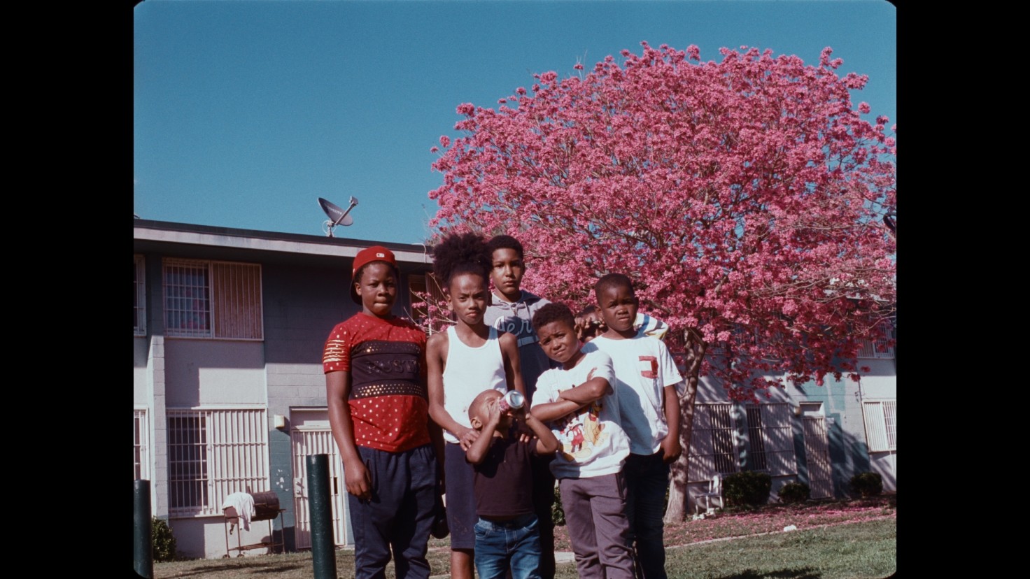
From If I Go, Will They Miss Me (2022), dir. Walter Thompson-Hernandez, color by Kya Lou. Image courtesy the filmmaker.

DOL: Can you speak about some of your more recent projects and how you’ve approached them differently?

KL: Ruby Sales [2022] by artist/director Adam Pendleton. It’s part of his presentation at [this year’s] Whitney Biennial. Adam put together a feature-length portrait of [activist] Ruby Sales, alongside cinematographer Chayse Irvin and editor Grason Caldwell. The film weaves in and out of black-and-white footage, 16-mm color, and a lot of archival. A part of the challenge with this film was negotiating the marriage between all of these sources. I approached this grade like making an album. Each scene is its own song, and I wanted it to feel like the grade traveled like Ruby’s mind. 

There’s also an untitled project by director Janicza Bravo. Janicza and cinematographer Adam Newport-Barra wanted the color palette to help take us to another world that didn’t look or feel like the one we currently inhabit. There are moments in the film where we paid special attention to how we manipulated the color to make things feel like a different time of day. We worked to create a palette that was elusive and not of this world. There are a couple untitled pieces by directors Joshua Kissi and Amandla Baraka. [I also colored] If I Go Will They Miss Me [2022] by director Walter Thompson-Hernández. 

DOL: Can you talk about an image reference that you love that inspires you? It could be any image, any reference from your family archive.

KL: There’s this one image of my grandmother that’s been my profile picture for a minute. It’s hella purple and you can barely see her face, but I like the way the shadows are cast in that. And how the shadows support that purple hue—that’s my driving force. That is my North Star. And I’m just following that because I haven’t done a project yet that has allowed for all of that to happen per se. I haven’t done a project that allows me to emulate that sort of metadata just yet. But that image, that’s my . . . I’ll send it to you.


Kya’s maternal grandmother in San Diego, California. 1970s. Photograph by her late grandfather, Robert F. Baxter.

DOL: What is it about that image for you? What’s the metadata in there?

KL: The metadata—it’s like, it feels spiritual to me because I think purple is one of the Blackest colors other than black. There’s something that comes with a purple experience. There’s Crown Royal bags. There’s the Purple Garden at the Underground Museum. There’s Prince’s Purple Rain [1984]. There’s DJ Screw. There’s Houston. There’s so many things tied up in the color purple. The Color Purple, God damn it! You know, the book, play, and movie. 

There’s something about the purple in that image. And it’s like a particular film stock, I think, that kind of did that. I’m still doing more research into it because sometimes I come across other archives that have that same color purple and I’m like, “How did you all get this purple too?” But it’s the purple in that for me, because I’m trying to also figure out how can color emulate what Black music is, or Black sound is, or Black visual culture. How can we be specific about color and draw connections to Blackness or to Black experiences? And I think purple is like the pathway that would take us there. Purple is motivating. Purple is royal. It’s also sensual. It’s also erotic. It’s so many different things. And I think there’s just so much metadata in that color alone. I think that image of my grandmother really represents all of that.